Hi David,
Thanks for the updates today! Page 4 is looking really good!
Here are details for page 1:
Let's just do a straight-up Hans Rosling / Gapminder thing. For context, you might want to watch a few minutes of this video, the parts from 39:00 - 41:30 and 46:30 - 48:50.
But child mortality seems too grim for the introductory pages of our zine, so let's celebrate life instead. (On the Gapminder site, you can play with the charts that I've captured below)
-----
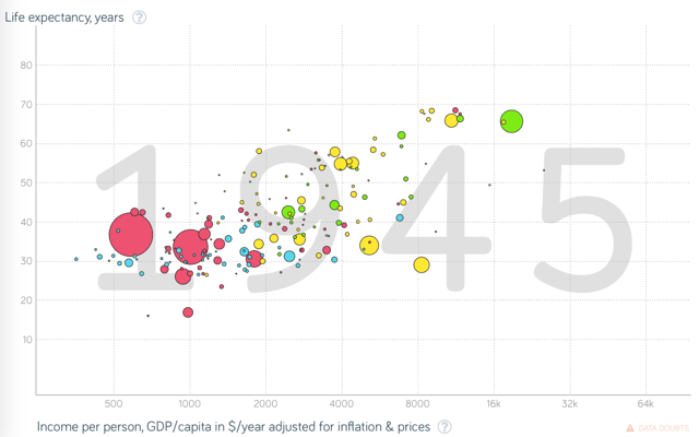
In panel 3, they're plotting life expectancy vs GDP, for the year 1945. The bubbles are different countries, and the size of the bubble represents population. (You don't have to draw all of these bubbles, just the gist.)
The X and Y datasets are set by putting cards near the paper -- in this case, a "GDP" card and a "life expectancy" card. (The two cards should probably be in the panel, but maybe we don't actually pay attention to them until panel 5.)
-----
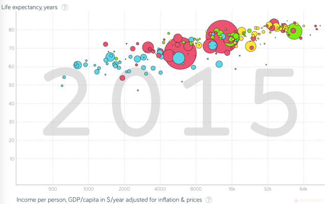
In panel 4, it's the same thing, but they'e scrubbed forward to the year 2015 using the go-stone slider.
-----
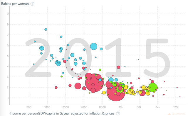
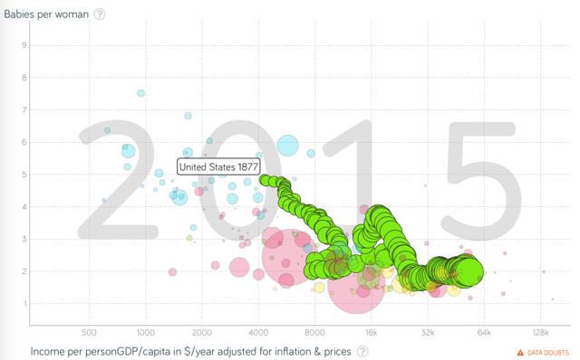
In panel 5, he's replacing the "life expectancy" card with a "fertility rate" card, and so the paper now plots GDP vs fertility cate.
In the background of panel 5, the person has put a second go-stone on the time-slider. The two stone define a range of years, which is shown as a trail-over-time for one of the bubbles (kind of like this, but not so thick, just a thin dashed line overlaid, or something).
I think he should be placing the second stone using thumb-and-forefinger, to show that these are physical objects that we pick up and move around -- sliding a stone with just a finger looks like using an iPad. (Maybe the all the panels should use thumb-and-forefinger?)
-----
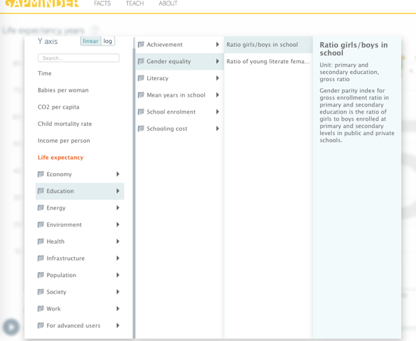
In panel 6, there's a book of cards open. Those cards are datasets. For examples, you can see a whole bunch of datasets if you click on the chart title in the top-left of the Gapminder site.
Here are some that I picked out, although maybe some lend themselves more to cute icons than others, so you can pick other ones if you like.
Life expectancy
Human Development Index
Improved sanitation
Food supply
Malnutrition of children
Literacy of youth
Literacy of adults
Mean years in school
Ratio girls/boys in school
Poverty
Extreme poverty
I think it's good to have several cards scattered around haphazardly (they were used and then thrown aside), with the two "active" cards placed more deliberately (close to the paper and aligned with it). You already have this in your sketch; I'm just telling you to go with it!
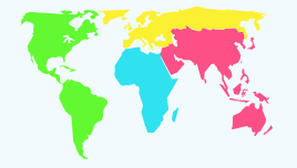
Re the globe, Gapminder's bubbles are colored by continent:
and ideally what's being projected on the globe in panel 6 would similarly tie back to the bubbles in some way.
I can imagine the countries on the globe having little numbers on them showing the fertility rate in that country in 2015 (or whatever's currently selected) (or possibly iconic indicators, like the wifi-signal-strength meter or the battery-meter on a phone, but maybe numbers are better) but this might be too tedious to get all of them right... Maybe just for a few countries?
In panel 6, you have a second paper with a graph on it. This should also be a Gapminder-like plot, but a different one -- maybe one that emphasizes the trail more. It should also have two cards next to it, setting its X and Y axes. I can find another one or you can mess around on Gapminder and find one you like.