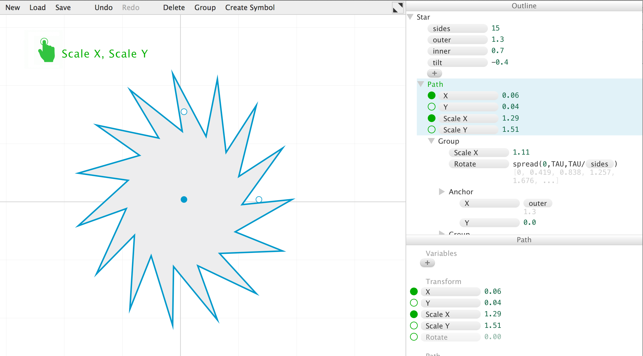
I agree with the both Bret's suggestions and Chaim's refinements, though one thing I like about the circles is that they are easy on the eyes when there are a lot of them. Cursor and hand icons are better indicators of function, but they are visually more complex. Maybe a compromise is to only use hand/cursor icons for active (currently draggable) parameters, while the others remain dots.
Playing around with Apparatus just now, I had a thought that maybe seeing the [active] parameter names appear near the graphic would help connect the dots, so to speak, between the parameters in the outline and the graphic. (I also made everything green instead of red, which is probably presumptuous of me. It feels less like a warning or "record enabled" to me, which is often how I see red used.)
Image and short demo movie attached…
