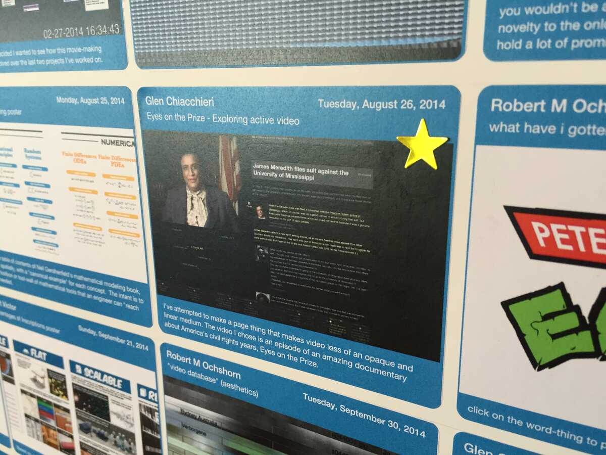
I noticed that it's kind of hard to find some things on the research gallery so I added some stars to things of mine that I pretty much always show visitors:

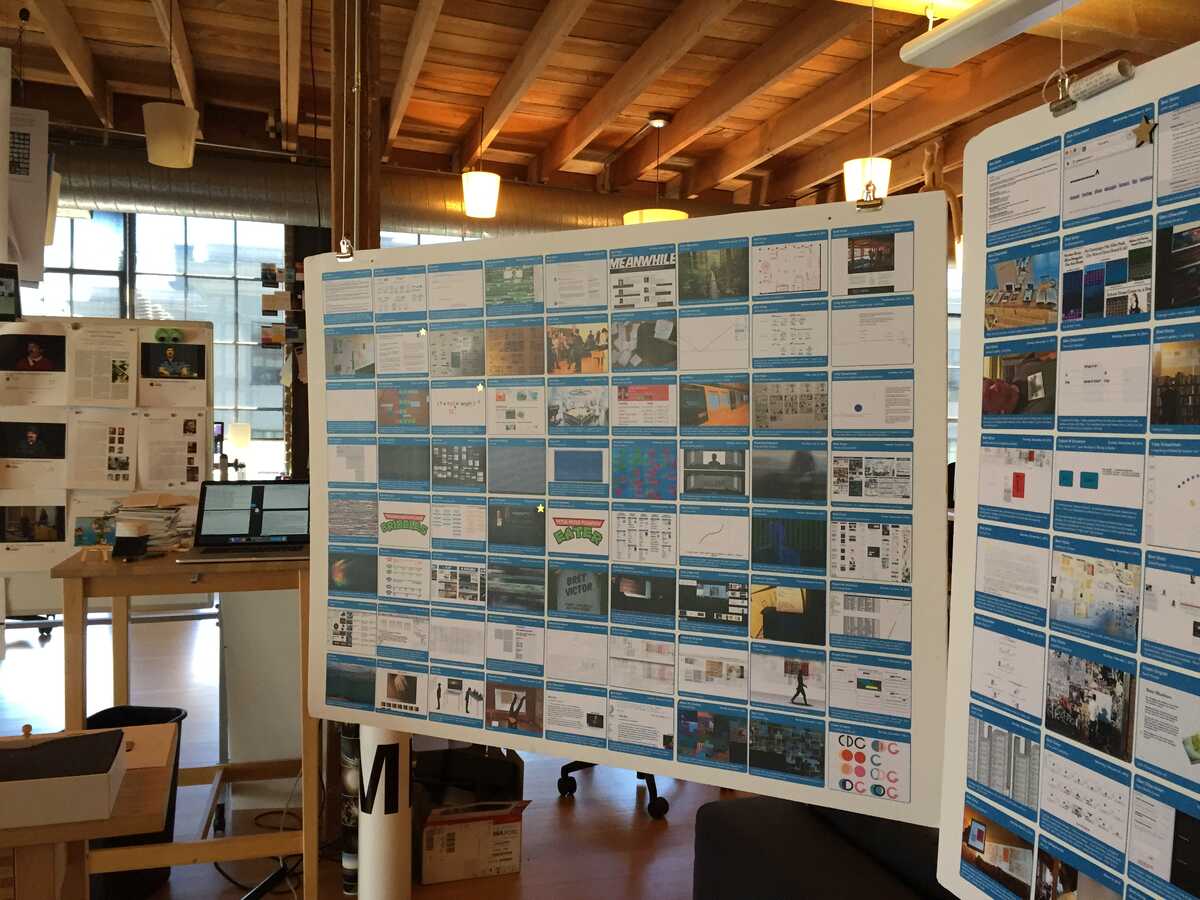
It's neat how they glow from afar when you catch them in the light:

Also, we should seriously start thinking about how we're going to scale/redesign the research gallery. It seems to get the most real-world use, and I think everyone has an idea of its flaws from that use.
(This is the email that I was about to send, but instead we had a conversation about in real life.)
On Tue, Jun 9, 2015 at 9:41 PM, Dave Cerf wrote:
What struck me about this video is how minimally the computer [screen] is used. So much of the interaction is in the space! As these prototypes feel more complete, it is easier to imagine a world in which spatial computing is taking for granted. Note to the team: amazing, amazing work!People often comment on how amazing it is to see young children using iPads, or how amusing it is to see them making swipe gestures on non-dynamic magazines. I tried mapping that experience into the era of the Dynamic Medium: in one case, I am an older adult, stumbling around these “new-fangled rooms” where everything lights up, and I watch a young child effortlessly navigate the space, adding search fields to pieces of furniture, browsing “animation books” on the ceiling, and just generally being magical. In another case: I take the same child into a conventional, non-dynamic room and they are baffled by its lifelessness. “Grandpa, the bookshelf isn’t working,” or something like that.From my own experience switching to Final Cut Pro X, with its “aggressive” skimming interaction where video is almost always playing or updating when you move the mouse, from Final Cut Pro (classic), and then back. What once seemed aggressive and baffling now feels “alive” and dynamic; Final Cut Pro (classic) seems dead now. There are actually times when that is nice—a kind of pause that allows me to think—like a clearing in a forest. Not everything needs to be dynamic all the time. But now that I’ve had a taste, I want that option in the world, and I want that option more often than not.On Jun 9, 2015, at 9:53 PM, Bret Victor wrote:I added thread highlighting and search to the research gallery.video: [IMG_7840.mov]When a label is selected, other labels in the same thread highlight in yellow:<IMG_7846.jpeg>I added a "search" label to the floor:<IMG_7841.jpeg>which brings up a text box on the kiosk computer, where you can type in a search term. Currently searches in "from" and "subject" fields.<IMG_7848.jpeg>Results are highlighted in red. Here's everything by Toby:<IMG_7842.jpeg>When a search is active, the "reset" portion of the search label highlights. Point at it to clear the search.