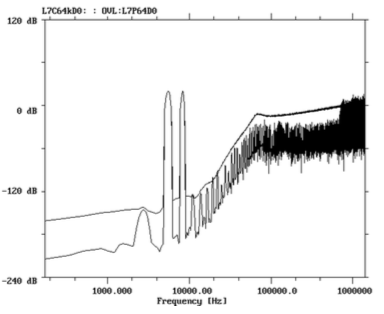
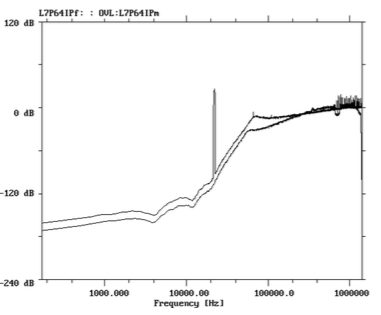
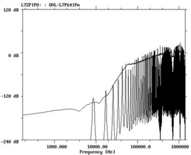
Just having your annotations on the diagram ("the forest of spikes near them") / arrows / hover text connections would be helpful in quickly understanding this.
On Wed, Aug 19, 2015 at 4:41 PM, Bret Victor wrote:
It's kind of funny that in audio engineering, the quality of an audio system is usually determined pictorially, often on a Fourier plot.The three artifacts that we are concerned with are:- harmonic distortion, which looks like this (lower curve. The two big spikes are the input signal of two sine waves. The forest of spikes near them are harmonics (multiples of the the input frequencies) and intermodulation (sum and difference frequencies). The harmonics are a result of nonlinearities in the system -- in a perfectly linear system, the only frequencies you get out are the ones you put in.)- noise modulation, which looks like this (the lower curve is with no input applied, and the upper curve is with a sine applied (visible here as a spike). Notice that the "noise floor" (all of the curve that is not the spike) has shifted in response to the signal. In a perfectly linear system, the noise floor shouldn't be affected by the input signal.)- limit cycles, which look like this (the spikes. This is a spurious output which appears with no input at all applied.)I was mentioning at lunch today that these effects can be fairly subtle to hear, so they are usually detected by seeing them on a plot. (Directly hearing them can require controlled "comparative listening" experiments.)And you have to know how to generate the plot! The harmonics plot, for example, was a result of "synchronous averaging" -- it's the FFT of the average of 65,536 data sets, where the time window is an exact multiple of the input frequency. This allows them to reduce the noise floor (incoherent signal) without affecting the harmonics (coherent signal), thus exposing harmonics that would have been visually hidden beneath the noise floor.On Aug 19, 2015, at 2:25 PM, Robert M Ochshorn wrote:This is very exciting!Coincidentally, I spent all morning today tracking down a bug in my live-transcription workflow, which turned out to be related to a naive audio resampling algorithm that I had implemented. It was only obvious where the problem was when I listened to an intermediate audio stream. If I knew exactly what I was looking for (I didn’t), I might have been able to see the problem in a spectrogram, but I almost certainly would have missed it in a waveform.Have you thought about what role sound—and time more generally—might (or mightn’t) play in this paper-exhibition? I like the idea that “zooming” into an instantaneous audio glitch/clip/overflow would (somehow?) transform it from sound to sight/touch. If the simulations produce audio, I could imagine an interesting form of bystander transfer (I like that phrase) where the bystander learns to hear some feature of sound that might otherwise pass unnoticed.Instrumentalists and audio engineers must develop amazing facilities of hearing. Can composers and codec designers get by with their abstractions and meters/metrics alone?RMOOn Aug 18, 2015, at 6:58 PM, Bret Victor wrote:[notes on an upcoming project]I'll be trying to redesign the paper Why 1-Bit Sigma-Delta Conversion is Unsuitable for High-Quality Applications in the form of an interactive exhibit of some sort. Sort of in the same spirit as the Watts and Strogatz redesign or the Latour poster, etc., but spatial.I find scientific papers to be more interesting targets for redesign than pedagogical material such as textbooks or "explainer" articles, because the paper author (a) has some new knowledge or idea they've personally come up with (b) that they want to convey to readers who can make immediate use of it. So both the writer and the reader are directly invested in the knowledge and the communication and understanding of it. As opposed to pedagogical material, where neither teacher nor student have any immediate reason to care, making it more about entertainment than useable understanding.This paper is a particularly interesting target because it's an argument. The basic gist is, "Sony is proposing a new standard format for encoding audio on CDs. This is a bad format, because it makes audio distortion impossible to avoid. Here is a technical proof, and examples and analyses of the different types of distortions that are induced. Here are some alternative formats which can be made distortion-free, and analyses showing how they're better. Audio engineers, please don't adopt Sony's proposal."The fact that it's an argument instead of merely a report gives it an urgency which makes both the writer and reader even more invested -- the writer wants to convince, and the reader (the audio engineer deciding whether to adopt this format) wants to avoid making a mistake. I think it will be an interesting task to design a specific, dense technical argument in the form of a space.The paper is also good for a design prototype because the examples can be made into interactive simulations without too much difficulty, and while I'm somewhat familiar with the subject matter, I've never "seen and played" with sigma-deltas in the way that a good design should allow. Also sigma-deltas are sort of mysterious and magical creatures.---The redesign probably won't follow the paper directly. The intention is that the paper's argument will "frame" the design -- you've downloaded this exhibit in order to be convinced about something -- but the actual material in the exhibit may go quite a bit deeper than what's covered in the paper.The idea is that the spatial layout will allow you to read/play at just the depth you care about for any given concept. If you are unfamiliar with some concept, you go down as far as you need into background material. If you already know some area well, you skip over the details and barely see them. Different readers will take different "paths" depending on what they already know about and care about.---Here are some of the design challenges that I'm thinking about:Familiar (not too worrisome)- How to visually organize elements of the argument. ("spread out") Visual hierarchy, skimming and browsing, getting the gist from a distance, etc. A number of the posters were good practice here.- How to visually represent concepts. ("show and tell") Like the Strogatz paper, there are a lot of nouns that can be depicted instead of described. This is always fun.- How to enable exploration of the examples. (In the original sense of explorable explanations -- giving readers an interactive model that they can use to investigate or refute the author's claims.) The techniques from multitrack signal processing and other interactive signal-processing representations will carry over here. Ideally, the reader should have the freedom to explore any question that the simulation environment can calculate -- like a spatial Mathematica notebook.Unfamiliar (I have no idea)- How to spatially organize elements of the argument. (it's an exhibit, not a poster) Breaking out from a flat, bounded poster and making use "all the space" is unfamiliar ground.- How to spatially represent and tangibly represent concepts. This is the most important one for me -- the challenge of designing new representations, instead of merely reorganizing old representations. Non-flat representations, instead of flat representations hung in a non-flat space.- How to enable rich tactile and kinesthetic interaction. Not just staring at things or sliding fingers on surfaces, but actually thinking with the hands and the body.- How to offer supporting material ("going deeper into background material") while avoiding peek-a-boo (multiplexed space) to the extent possible.- How to enable bystander transfer. Imagine that the exhibit is downloaded by an experienced audio engineer who already knows a lot about sigma deltas. Ideally, we'd like a nearby colleague, who perhaps knows nothing about signal processing, to be able to pick up a sense for it simply by casually being around the first engineer as they interact with the representations. This is the effect Hutchins describes.These "unfamiliar" challenges are quite daunting, and I don't know how successful I'll be with any with them, or even the redesign itself.


