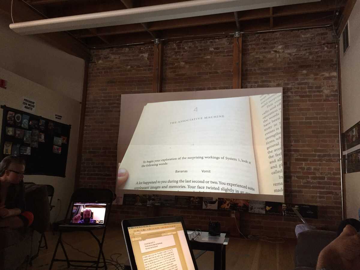
The snapshot to the big screen tool was really helpful to the discussion. I like the ones where we see your thumb. It's like you're really showing us the thing in the book.
You could also do it without everyone having to configure their personal phone by just having a dedicated mobile device for it, since the interaction is "let me show you this" (it's not a back channel) so the group can just pass the camera to the speaker.
I noticed that Nagle did a bunch through screenshots of his PDF. If you added clipboard support this would be easier for posting screenshots.
This was really successful and I think making it more seamless would be great for future book club meetings.
On Thu, Jun 25, 2015 at 6:21 PM, Glen Chiacchieri wrote:
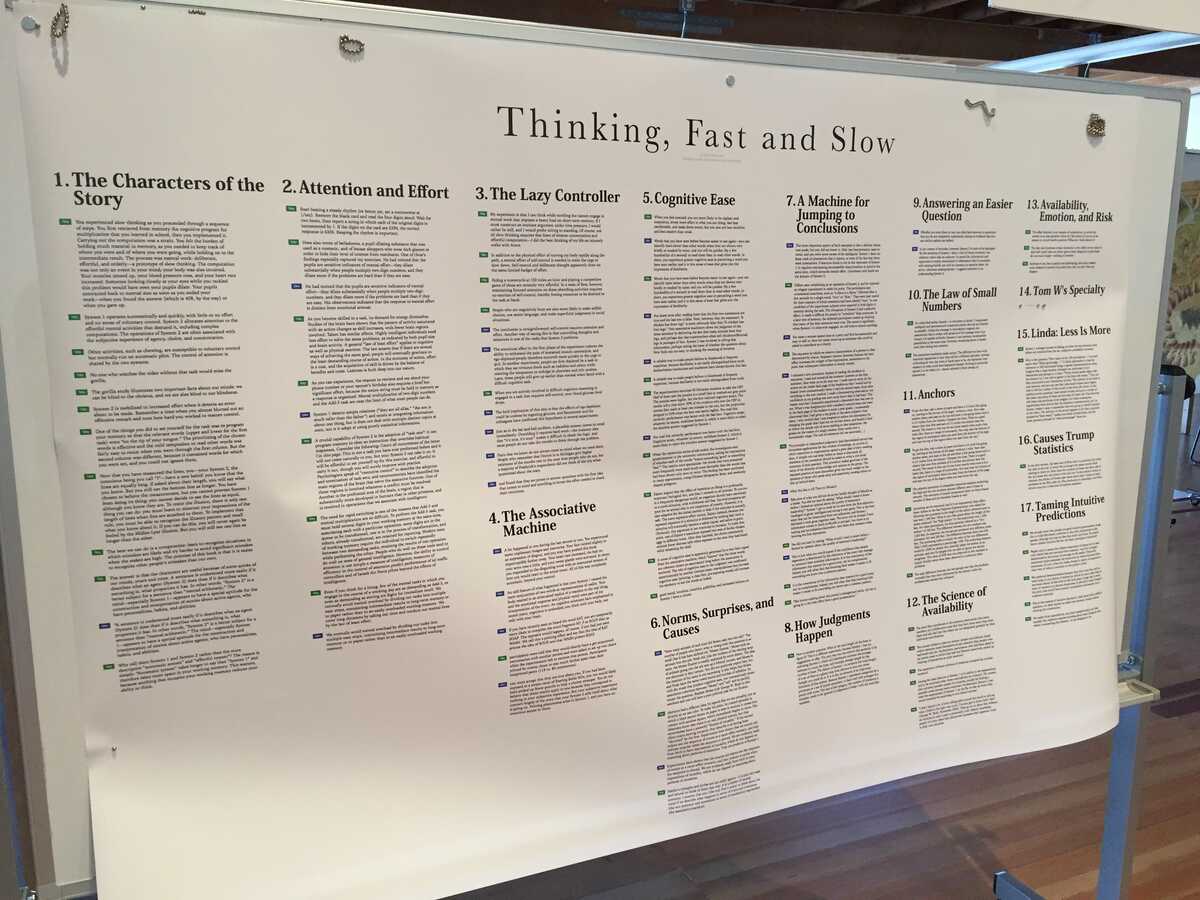
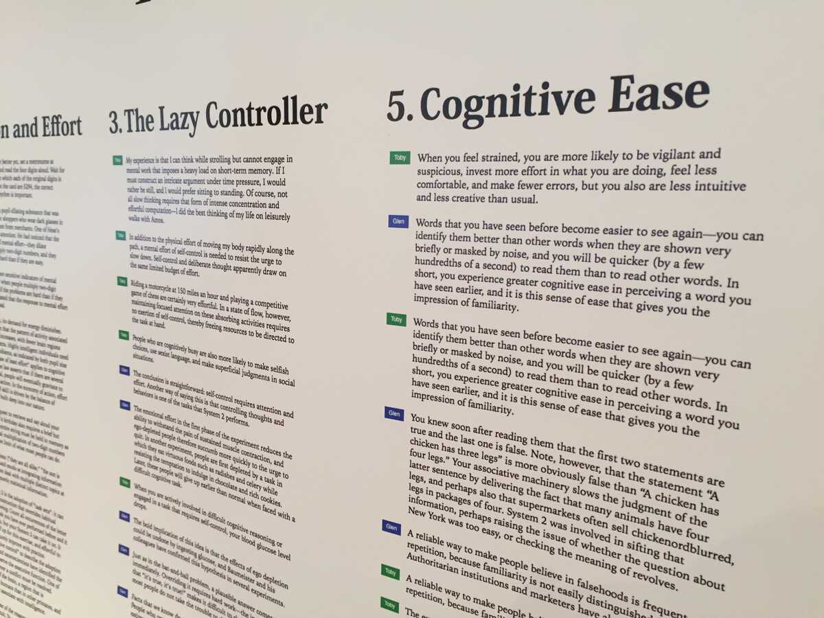
I made two things for our book club meeting of Thinking, Fast and Slow.One is a poster of highlights Toby and I took while reading the book:I'm in blue and Toby is in green:(because of browser bugs, I wasn't able to print this out at a high enough resolution, so there's an annoying font blurriness)I was hoping to have highlights for more than just two people, but that's the only data I had access to. I was also hoping book group members would take a look through the annotations before the discussion so that a) they would be grounded in what the book what was saying before the discussion and b) they could get a sense of what was interesting to other members of the group. For example, I might like to see what caught Toby's interest in the Cognitive Ease chapter, or Nagle's in The Lazy Controller chapter. Partly because of last-minute printing, partly because of the group coming back from lunch, and partly because I didn't ask the group to look at the poster, this didn't happen.One note about annotations: I didn't add annotations to this poster because Toby didn't make any, and I only made a few. I think I agree with Rob's thinking lately that annotations that are meant to be published--whether to friends or a general audience--are generally better in a group context than notes you took for yourself.And one thing that's difficult: this book was not designed to be read and discussed in a group, and I felt in this discussion that we were really fighting the format of the book. People had fleeting memories of things they read but couldn't find them or show them to other people. People mentioned that certain studies were refuted, but couldn't bring up the original study or the refutations. It was also such a dense book that it was hard to remember everything it talked about. This experience makes me wonder more what it a book designed for group discussion would look like.A thing I also wonder: if group members had come prepared with specific things they wanted to bring up (maybe like mini-presentations) would that help the discussion?---The other thing I tried was to make a small website that would allow people to take a picture with their phones (or a screenshot on their laptops) and have that picture show up on the big screen:
It had some technical difficulties and people weren't completely into using it (mostly my fault), but when it worked, it was really nice to have a shared object of attention that we were all pointing at and focusing on. It felt like it really grounded the conversation.Here are some of the pictures that were put on the screen (my terrible 5am code lost some of the pictures from earlier in the discussion.)Something I just realized might be nice is if these pictures stuck around visibly in the space, even if they weren't huge and bright and in everyone's face. I'm imagining the photo physically crawling off the screen, shrinking down, and crawling somewhere peripheral in the space so that it could be referenced again if needed. Maybe for the next book club...


