This thread is so great, and I’ve been meaning to respond for ages. First I was going to troll (?) with a Hilbert Curve number chain, but I realized that sound is probably our perceptual sense most sensitive to periodicity, so thought to apply some of these ideas to audio signals.
This sketch is by no means fully ready or resolved yet, but it is beginning to show the faintest glimmer of interest, so perhaps it will allow me to start explaining why I’ve so enjoyed these number rectangles.
counting.mov (2min, 18mb)
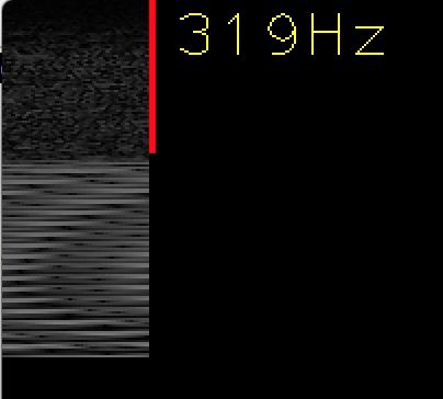
Representation of audio has been a recurring topic on this list. I’ve advocated for spectrograms (chrome/ff-only; also available bigger) in opposition to waveforms, but really I don’t like either very much. I dislike waveforms because they’re so lossy. Maybe an experienced sound editor is able to recall a sound by these amplitude graphs, but it’s simply impossible to look at this (soundcloud) and see much anything of the tone within without having heard it before:
And I dislike spectrograms because they’re so detached/disconnected from the “raw” data. When you start learning about sound, it’s easy to believe that it has two properties: amplitude (loudness), and frequency (pitch). But of course the latter is not independent of the former: frequency is the periodicity of amplitude over time. And only the highest end of software allows direct manipulation of a spectrogram, and I don’t even know how general-purpose that is.
What I’ve tried to do with this sketch is to apply the CDG imperative—“show all the data”—and add our new signature technique, as demonstrated throughout this thread: data-columns. All of the sampled audio intensities are shown left to right, top to bottom, and moving the mouse “flows” the audio at different rates. When patterns start to emerge, that is perceived by the auditory system as “pitch.”
Intuitively, I feel like it should be possible extend this visualization to show all of the frequencies at once—as with a spectrogram—but to do so in a way that really connects with the raw data. Ironically, the fast fourier transform used to generate most spectrograms is actually an algorithm that keeps the original data miraculously intact, through some voodoo bit-switching reordering. But that transformation (from amplitude to frequency) is never presented to the person working with the sound.
I wonder if sound could be used (to convey periodicity) in the more friendly sketches May-Li, Toby, and Bret have made… or if I could learn, someday, how to make friendly, playful things.
RMO
On May 10, 2015, at 1:42 AM, May-Li Khoe wrote:Ohai! Thank you!
I had been daydreaming about something along the lines of the last one you showed when we first brainstormed about our early math stuff last fall…
<PastedGraphic-2.png>
…but had only gone as far as keeping the periods fixed, but with a similar spirit of seeing periodic artifacts in the number grid (and a minimum of 100 elements just to nail the visual periodicity home a bit more).
<number patterns 0.mov>
I’d wanted to have it facilitate a kind of “number weaving” – was hoping to layer various combinations of the periodicity to relate back to things along these lines, but haven’t had a chance to dig in (maybe that means I shouldn’t mention it yet? I am unsure of this mailing list’s completeness-of-thought etiquette.)
<Tablet_Weaving_Patterns_by_eqos.jpg>On May 1, 2015, at 7:37 PM, Bret Victor wrote:
I thought it might be interesting to animate the moving numbers, so you can see where they're going.
http://worrydream.com/NumberGrid/
Move the mouse left and right.On May 1, 2015, at 6:53 PM, Toby Schachman <****************> wrote:
Hi May-Li,
I was thinking about the prototypes you showed me about understanding the concept of number. Inspired by that, and your principle of the learner controlling the educational artifact rather than the other way around, I made a prototype of a rectangle of numbers that you can adjust to see the periodicity patterns formed when there are different numbers of rows and columns, like so:
live demo (Chrome)
https://dl.dropboxusercontent.com/u/1802603/web/snapshots/2015-05-01-apparatus/index.html?snapshot=-JoH9Zfo1BKqDav9GkVA
The idea is to hint at the structure behind the number system. Hint at the existence of a more powerful understanding of number that can be used to generate other concepts about number.
I also tried a version where each number is colored uniquely (kind of haphazardly).
<image.png>
https://dl.dropboxusercontent.com/u/1802603/web/snapshots/2015-05-01-apparatus/index.html?snapshot=-JoHCkJ4-u1xLCNgtkqH
But I think the arbitrary color obfuscates the structure, at least with the coloring system I made (which has periodic artifacts). Maybe adjustable color could be used to show a third periodicity.
https://dl.dropboxusercontent.com/u/1802603/web/snapshots/2015-05-01-apparatus/index.html?snapshot=-JoHE_F8cEVXIT1TSJCb