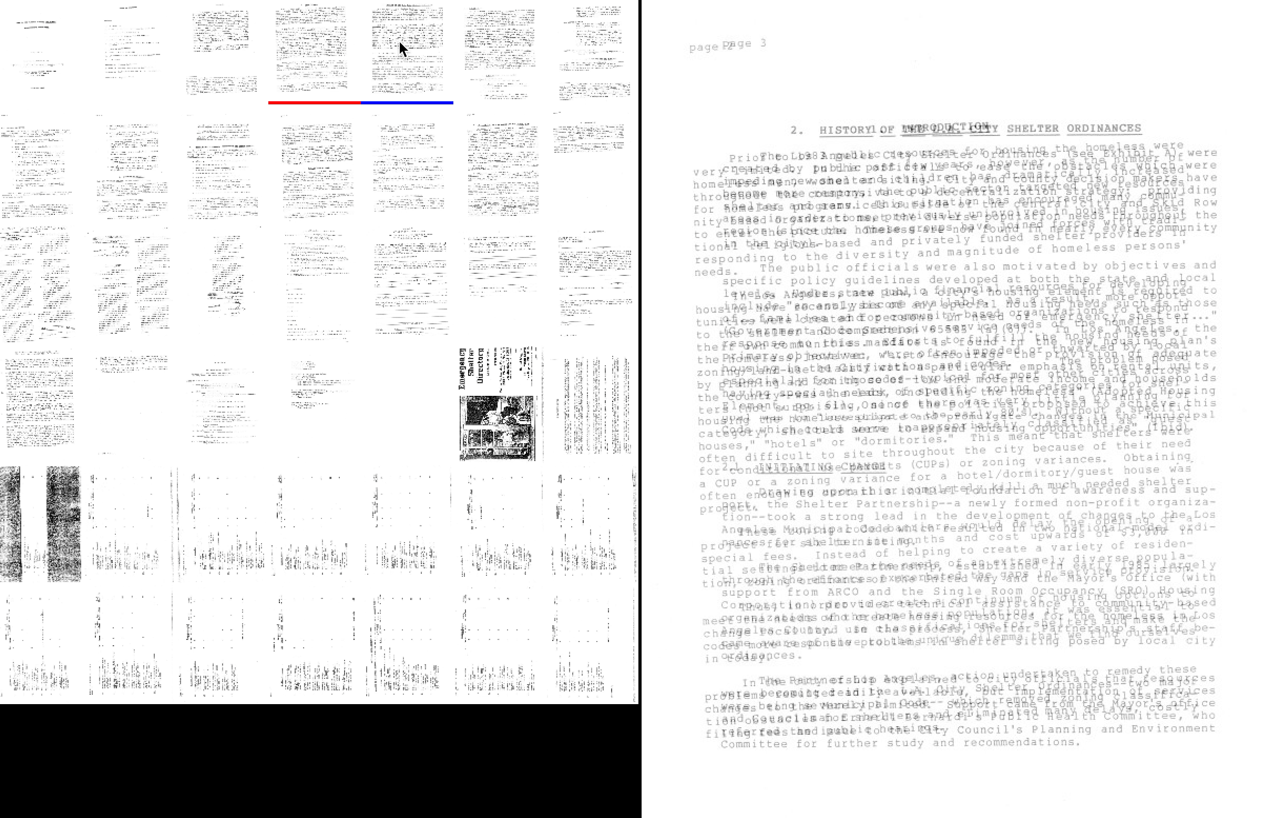
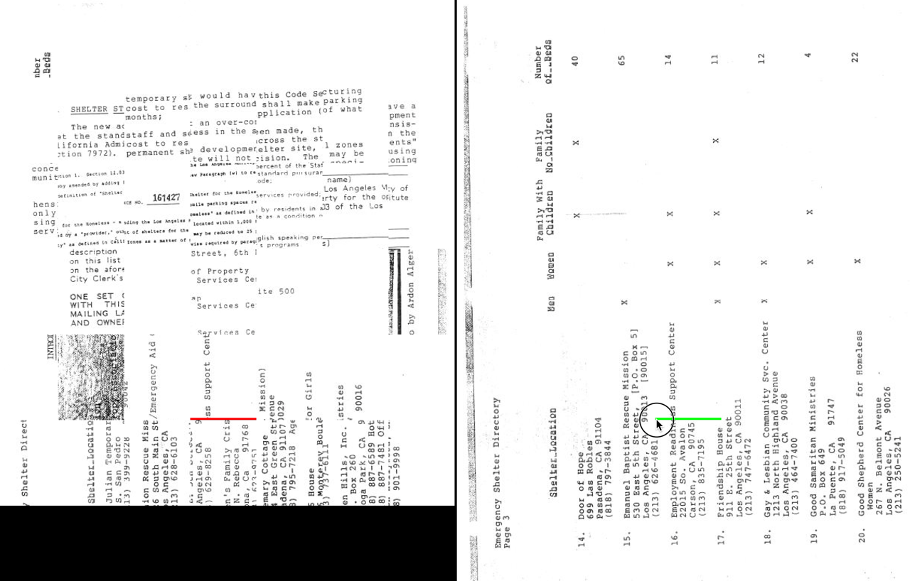
I think the screencast helps. I thought I understood the full potential based on the images. But the feature to compare the red selected page to the blue hovered page only comes through when you're moving the mouse around.

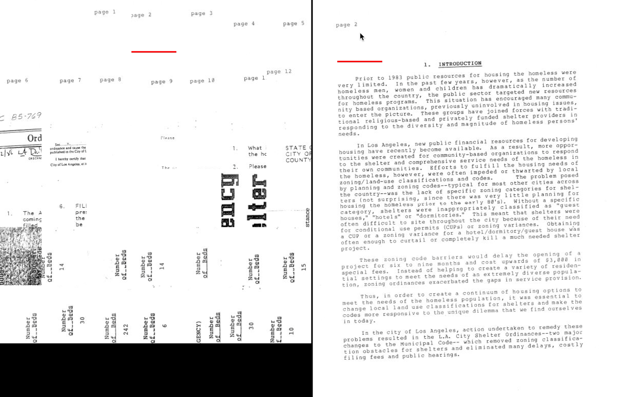
The "confusing" feature remains confusing. I think it needs a good example if you want it to not be confusing. A good example might be a photo collection of faces all in roughly the same position.

I get what it does intellectually, I think. It's really making a blend between the left view and the right view. It's faceted like the left view, but 100% zoom and full coverage like the right view. So it wouldn't be any less correct for the right view to become the confusing view instead of the left. Maybe the thumbnails should remain on the left, the full page on the right, and the confusing view in the middle.
On Mon, May 4, 2015 at 5:46 PM, Robert M Ochshorn wrote:
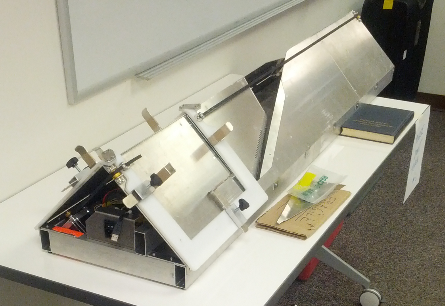
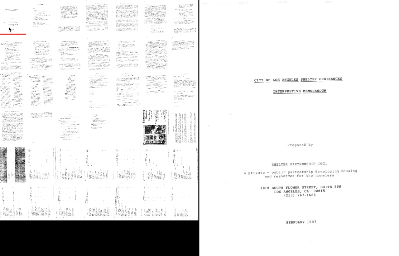
DanyQ is making a book scanner inspired by a deli slicer.Deli SlicerDanyQ’s Book Scanner [v2 is pictured, v3 is nearing completion —ed]Unfortunately, most PDF readers don’t let you slice and dice PDFs with a dexterity befitting this glorious machine.In particular, the most trivial of questions—do I have all the pages? Are the pages lined up?—are exceedingly difficult to answer with conventional PDF readers and image viewers.This afternoon, I made a prototype that enables some fluid, virtual, slicing of PDFs.Thumbnail grid on the left, enlargement on the right.Hat tip to Dave on arranging the thumbnail grid with the same aspect ratio as the page (more on this in a second).Hover over a thumbnail to see an overlay of the selected page and the hover page.Hover over the enlargement to enlarge all of the thumbnails at that part of the image.Click/drag the enlargement to reconstruct a complete page out of all of the thumbnails (confusing feature, but depends on the aforementioned aspect ratio trick).On the drive back from LA, Bret and I were talking about in-process documentation and screencasts. I tried to make a stream-of-consciousness screencast to show myself using this interface, and how I was thinking about it. Even though I wanted it to be casual, it took four takes before I had something even vaguely comprehensible. In any case:Your correspondent,R.M.O.

