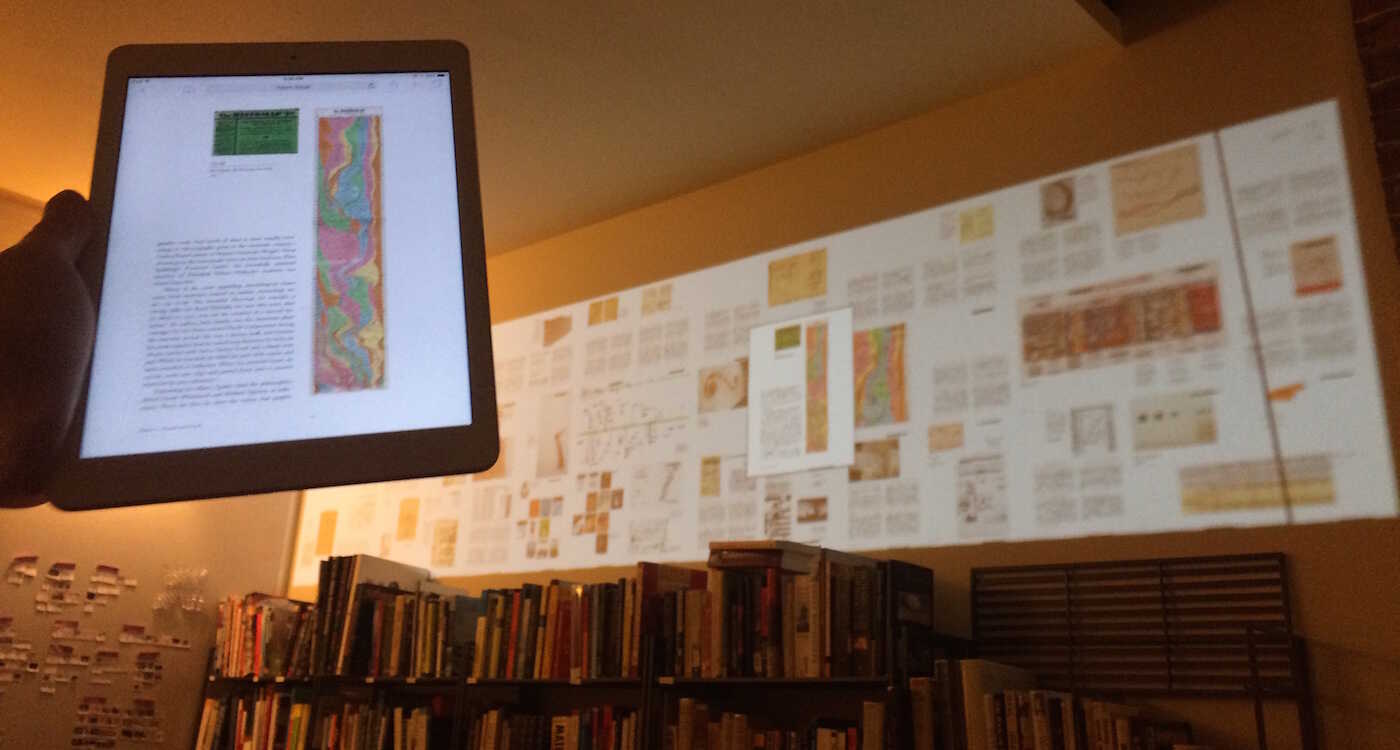
Using a grid instead of a smoosh on the wall, and horizontal instead of vertical scrolling on the iPad.

Actually pretty good at allowing you to see your place within the whole, see the surrounding context, and jump around within the whole.
45 pages are shown here (that's the extent of our 2-chapter excerpt of this book), but I was able to go up to 200 pages and still have them be somewhat recognizable, at least for a densely-illustrated book such as this one.
You can think about ways of showing the current chapter larger and the surrounding chapters smaller, while allowing for easily skimming through chapters ("Where was that one page I'm thinking of?")
