I love the Ken Perlin prototype.
(As an aside, I am also appreciating Ken’s other post about the portable fish and how it might relate to the reasons we get songs and lyrics stuck in our head, looping over and over.)

In the Perlin proto, the “iPad” (from Bret’s proto) and the pages above the bookshelf are mashed together into a single glowing rectangular screen. Toby, I know you’re focused on the search terms here, so I don’t mean to derail that comment. Rather, I’m still wrestling/curious with what it means to be freeing the book’s pages from the glowing rectangle.
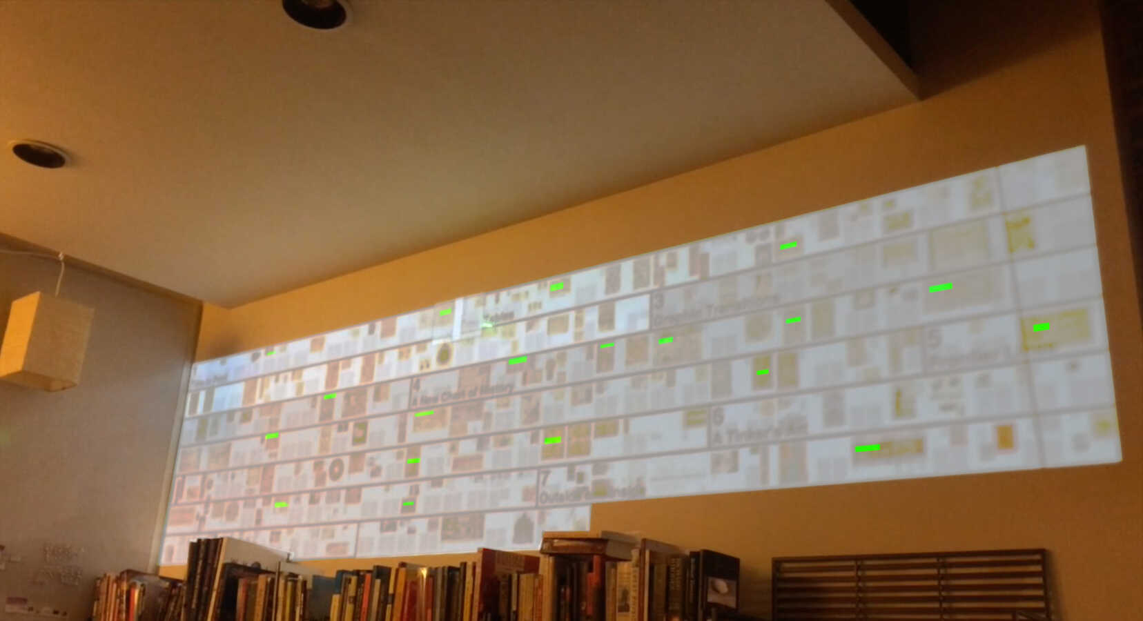
I was curious to see Perlin’s prototype (PerlPro), so just sketched out the simplest possible solution—little highlights that appear on the wall.
I really like the part in the PerlPro where he highlights a word on the page and it is highlighted everywhere in the book. At first, I was concerned that the projection above the bookshelf has such tiny text that you can’t really see the terms clearly, but the PerlPro has the same issue, and it’s not really an issue at all, since the highlighted terms are more about an overview—you can use the iPad to see the details.

On Mar 7, 2015, at 8:08 PM, Toby Schachman wrote:
Reminding this work again. Seems like highlighted search terms would be really nice in this context now that all the pages are visible and pinned to the wall.<ken mapping novels.mp4>On Wed, Mar 4, 2015 at 10:28 PM, Bret Victor wrote:Now with the entire 238-page book, broken into chapters.Looks a bit better in person than in the video. The thumbs are pretty small, and the wrapping isn't ideal (might be better wrapped to columns?), but it does give a nice "map" of the book. You know exactly where you are, both within the chapter and within the book. And jumping anywhere (including to the beginning of any chapter) is really easy and feels good.(By the way, the weird vertical black line near the right side is due to a hanging string that's blocking the projector, which is holding up the Maxwell hanging-mobile-diorama thing.)<IMG_7199.JPG><IMG_7200.JPG>