I thought I would also document the current arc of this project so far. Maybe I have told everyone individually all of this already or they've heard it at lunch? Still it seems good to jot it all down, and I don't think it's been on this list yet.

-------------
The initial inspiration came from playing with my biologist friend's example about cell growth in plants. He sent me the excel worksheet he used in his class -- two kinds of cells, two kinds of signals, with rules about how they each live and die. Toby and I then went through the rules with physical tokens. Since there were quickly hundreds of cells, we used a notion of place value, stacking tokens on top of each other to get to 10s, 100s, etc.
We found in the physical representation,
* it was much clearer than the excel representation
* we lost track of state, i.e., what happened three iterations ago?
* it was hard to deal with hundreds of cells, even with place value
* it was impossible to meaningfully change parts of the algorithm and see how the behavior changed quickly.
(Unsurprising but worth noting.)
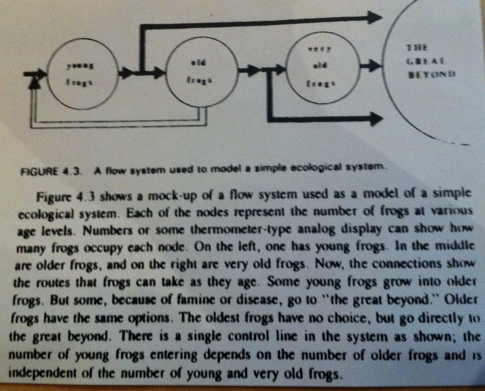
We then got on to talking about token systems and Toby's interest in tokens-as-thinking-systems, and started talking about making a system to represent token systems. On the whiteboard we tried out two systems: a state diagram about frogs maturing and dying pulled off of Toby's whiteboard:


The predator-prey equations interested me a lot in this system. The token system turns things an iterative and discrete representation. I feel like in the predator-prey equations, it's the 'xy' terms that are particularly weird and hard to understand (but also particularly interesting and powerful.) What *does* that term really mean? I liked iterating with tokens as a way of trying to understand that -- making up a rule set that seemed to fit those equations and then just seeing what happened round after round.
-----
We got interested in the wall after hearing Bret talk about The Room at lunch one day. We thought it would be neat to mock things up on the wall, in a way where we could pull up a couch and mock things up together. (I told my friend about this project and he said 'a couch seems to be really important in this description.' Apparently I was saying 'couch' a lot. But maybe it is an interesting indicator -- the emotional tone of hanging out with someone on a couch is different than two people at a desk...)
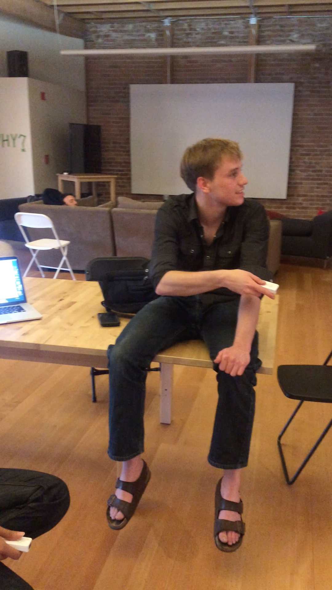
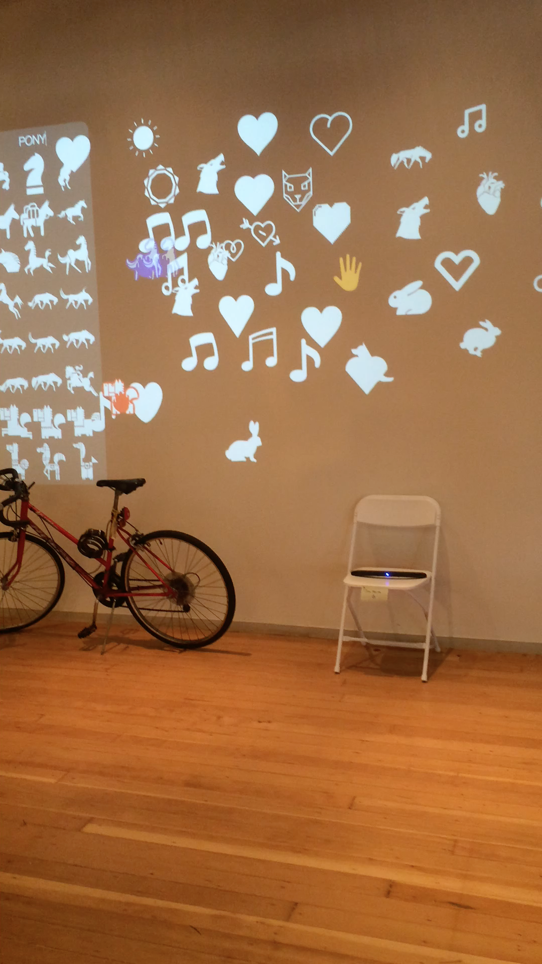
This led to playing with the noun wall, and Wiimotes as interfaces, which I think Toby documented well during the week and above.
The next step here is to add behavior -- a way for a user to create rules about their icons / tokens, and a notion of iterating over those rules. There are floating questions: is there a specific section for rules, like a right-hand column? Do you attach behavior directly to an icon (we talked about Hypercard as an example of an interface where objects had their own scripts.) Do rules get overlaid on the token board and then vanish once the simulation starts running?
This feels fuzzy and like the next thing to play with. I think one of my questions is that the wall clearly creates a kind of social context for the project. People come, play with it, offer commentary, and there's something fun about that. Trying to run with that, we have the beginnings of a way to make a simple icon-driven mockup together on the wall. Are there ways to keep going with that as we add behavior?

On Fri, Mar 6, 2015 at 4:47 PM, Toby Schachman wrote:
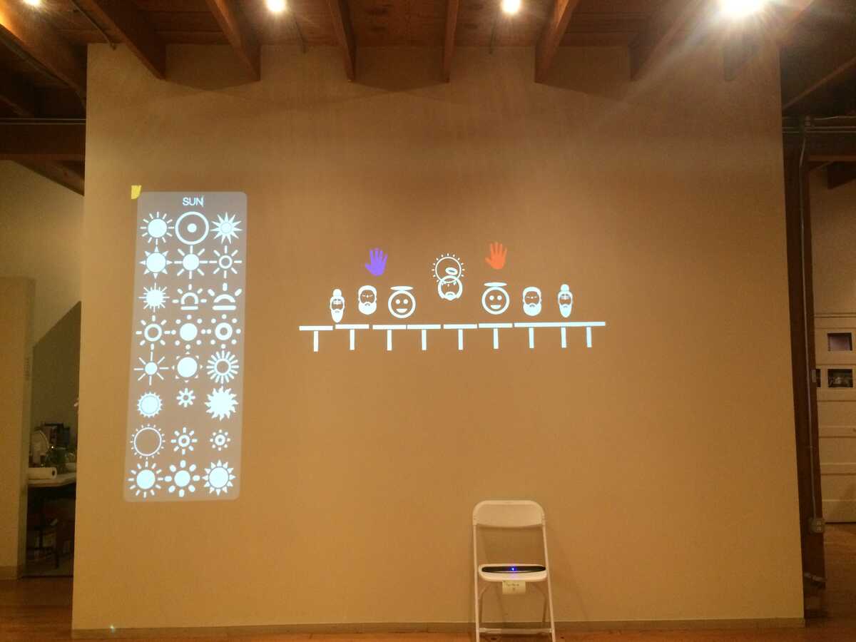
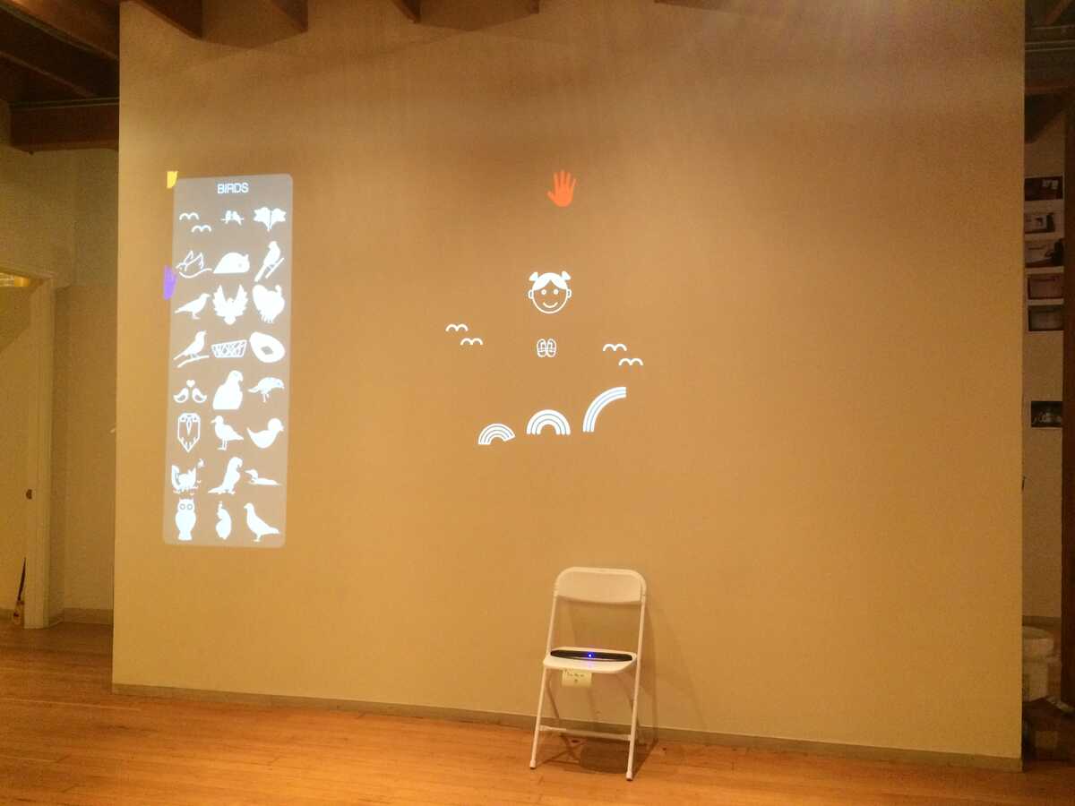
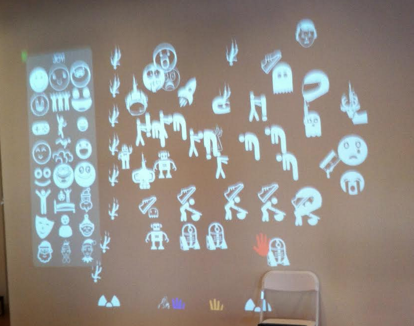
Combining the last two wall projects, search nouns and move them around on the wall.During development, we get a lot of comments from the peanut gallery. Some are useful (Emily's suggestion that dragging an icon back onto the search area should delete it).A group of people collectively invented a pictionary-like game and started evolving the rules (put a whiteboard in front that obscures the guessers' view of the search area).The Last SupperSomewhere Over the RainbowI'm finding tension in the desire to position icons precisely and the imprecision of the Wiimote as an input device. We tried snapping the icons to a 100x100 pixel grid which feels totally fine, so for "snapping" applications it shouldn't be a big deal. We'll try ways to "nudge" icons next.Putting up our own IR LEDs that are farther apart than the provided thingy (sitting on the chair) might also help a bit with precision. I have ideas for a Wiimote "debug view" (based on Glen's suggestion) that will help us explore this.
