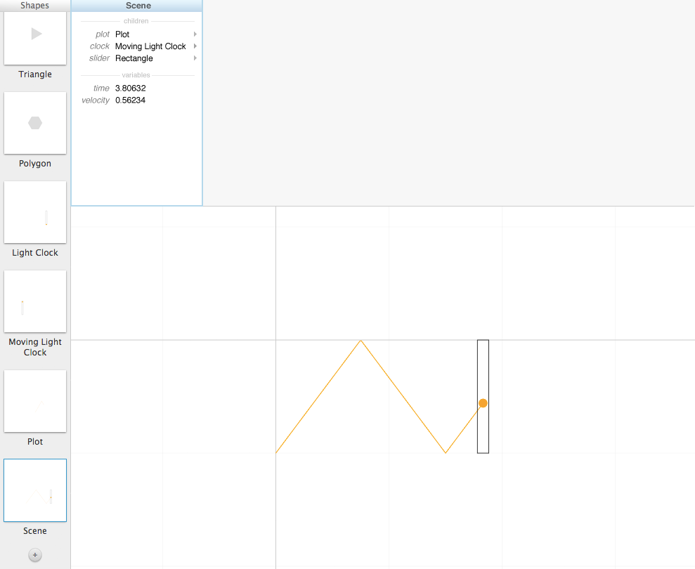
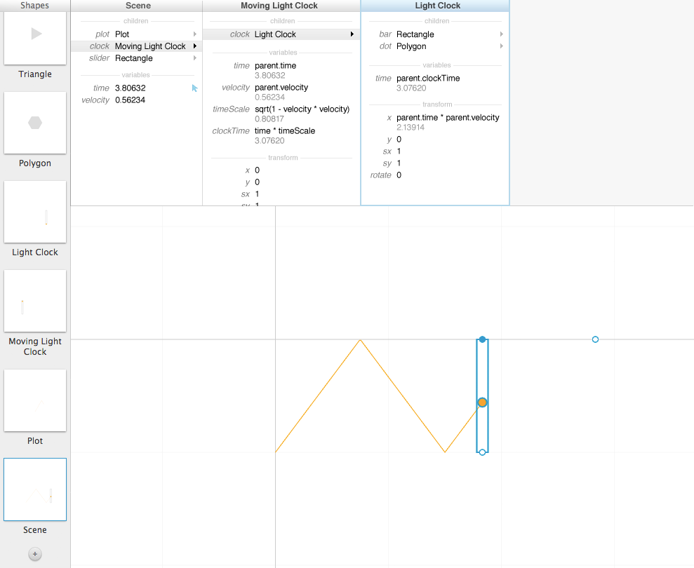
I was playing with consolidating the three panels on the right side of Toby's tool into a single column view.


video: [toby-column-view.mov]
When you select an object, you see its "card", which presents everything there is to know about that object -- its child objects, the variables it defines, and its transform. You also see the cards of all its ancestor objects. I think this makes it more clear where variables are being defined and how they're being used, as well as invites exploring the hierarchy.
This suggests a different kind of scoping than in the original. Instead of definitions only being able to reference the parent's variables, here unqualified names refer to the object's own variables. (For example, you can directly refer to an object's "x" and "y".) You use parent.variableName to refer to the parent's variables. (I think this will be clearer than the original, where you often define "x" to be "x", etc.) You can probably even go up-and-around like "parent.parent.slider.sx" to refer to objects elsewhere in the hierarchy -- this might address the problem in the original of having to "thread" variables through the hierarchy.
Up-and-around works here because the child objects now have names, which is also important just for documentation purposes.
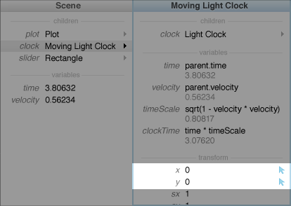
I've indicated "what variables will be adjusted by dragging the selected object" with a little blue mouse-pointer icon. By default, dragging an object affects its own "x" and "y" --

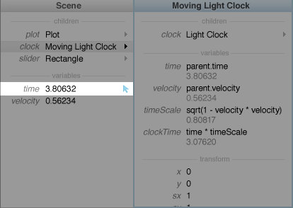
But you can click that icon next to any numerical variable anywhere in the hierarchy, and now dragging the selected object adjusts that variable instead --

For example, you could click the icon next to the object's own "sx" and "sy", and now dragging on it scales it instead of moving it. I'm not sure whether Toby's current implementation works this way, but I don't see why it couldn't.
