On Nov 6, 2014, at 6:32 PM, Bret Victor wrote:
Can you do this one? http://janicel.com/wp-content/uploads/2013/11/Cartographies-of-Time-Excerpts-Ch-1+7.pdf
Printing!
I don’t have much methodology for choosing aspect ratio:

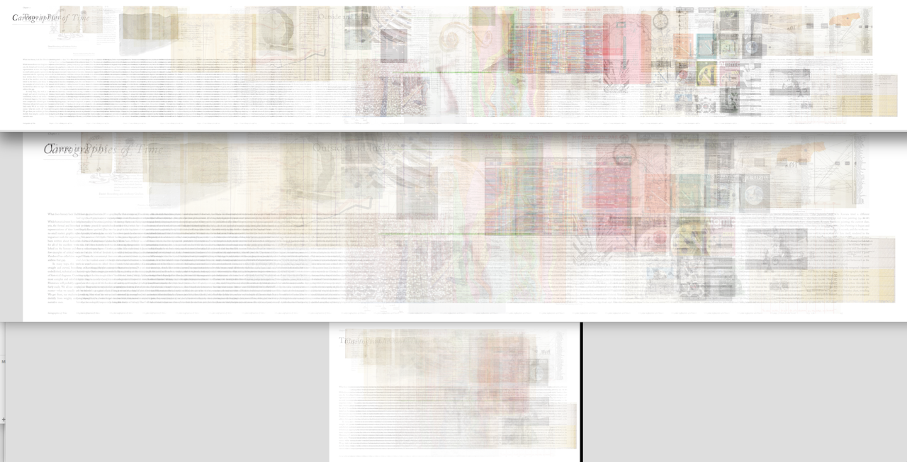
The original point, at least, was an “interaction” (from bottom to top), but I think (ala Magic Ink) there’s still more static design possible. For example: what if all of the sub-rectangles you highlighted were opaque instead of translucent? Then you could get a view of all excerpts in pseudo-context.
RMO
On Nov 6, 2014, at 6:14 PM, Robert M Ochshorn wrote:On Oct 31, 2014, at 11:16 AM, Glen Chiacchieri wrote:I'd be curious to see how this looked with more image-heavy/colored stuff, or how this might look if adapted from your iphoto clips library. I'll lob some PDFs at you that are sitting on my computer in case you're also curious<Screen Shot 2014-11-06 at 6.05.25 PM.png>One cool thing (@cgingold)—hope you can see it at this scale—is that if the source material has regular formatting of pagination, you get some context “for free”:<Screen Shot 2014-11-06 at 6.02.53 PM.png>& the bomb; having flipped through this PDF prior to making the rendering, the black feet image about 3/4 through stands out dramatically:<Screen Shot 2014-11-06 at 6.08.36 PM.png>I now have a script to render these at arbitrary resolutions and sizes—let’s figure out if there are any we should plot!R.M.O.