Chaim, I agree that it would take some work to make it easier to understand what's going on. Rob and I were discussing about ways of "directly manipulating" the zoom level to make it clearer. But as a prototype done in a morning, I'd say this is a success :)
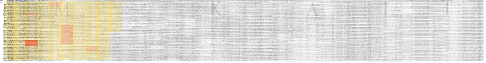
Rob, I wonder what this would look like with an annotated pdf/library:
The yellow could be what you've read (or at least looked at) so far and the red could be sections you've marked/annotated as you read.
The red sections are different opacities because it occurred to me that not all highlight/annotations are equal! Why not have shades of reaction?
In fact, the yellow "what you've read so far" sections could become more opaque the more time you look at specific passages. This would create a sort of heatmap (ugh) of where you've spent your time. And of course this might be extended to everyone that's ever read a work so you could see how all readers have interacted with it.
On Fri, Oct 31, 2014 at 12:08 PM, Chaim Gingold wrote:
Robert, the video is cool, and I’m excited to see where you go with this. At the risk of sounding like a broken record, I wish the meaning of the user input was clearer to someone looking over your shoulder, in this case a watcher of the video. The word “hierarchical” in your email helps me interpret what is going on in the demo, but it would become much clearer with more navigational visual cues (e.g. mouse axes mapping could use intermediate visual cues to explain the meaning of user gestures and actions).cOn Oct 31, 2014, at 11:16 AM, Glen Chiacchieri wrote:I'd be curious to see how this looked with more image-heavy/colored stuff, or how this might look if adapted from your iphoto clips library. I'll lob some PDFs at you that are sitting on my computer in case you're also curious.<Cohn - Comics, Linguistics, and Visual Language.pdf><ResearchAgenda-v0.19.pdf><twonotesonnotation.pdf>On Fri, Oct 31, 2014 at 7:08 AM, Robert M Ochshorn wrote:I think an exercise this morning—adapting my GPU timelines (which I recently pushed to a hierarchical qty of video) to PDFs—made me realize what I like so much about them.<Screen Shot 2014-10-31 at 2.52.16 PM.png>Here, of course, what sticks out are the drop caps marking section starts. One could speak of this is a success of the timeline as a data visualization, but I think that would miss the point of what’s really shown here, which is the fogginess and ambiguity in between: an explorable texture that shows the space of what has not been read or understood, an unexplored landscape—if you will—waiting for the reader to plant flags and build bridges and power plants &c.Back on Monday—miss you all!RMO